大屏可视化项

项目描述
技术栈:React + ReactRouter + Echart + Typescript
这个项目是我在学习适配大屏与 Echart 时,仿的开源项目做的。
页面布局使用了 Grid 和 Flex 布局,使用 rem 动态记算适配不同尺寸的屏幕。
项目中包含的图例有柱形图、折线图、饼图、地图和表格等。
通过这个项目,我掌握了大屏可视化项目的制作技巧。
适配屏幕
市面上大部分的显示器几乎都是16:9的尺寸,也就是1920 * 1080的分辨率。
理想中的效果:
当屏幕的尺寸比例刚好是16:9时,页面能刚好全屏展示,内容占满显示器

当屏幕的尺寸比例小于16:9时,页面上下留白,左右占满并上下居中,显示比例保持16:9

当屏幕尺寸比例大于16:9时,页面左右留白,上下占满并居中,显示比例保持16:9

当屏幕大小改变时,动态计算中间内容的显示比例大小,保证内容一直保持16:9
.gif)
解决方案: rem
rem(font size of the root element)
是 css3 中新增的一个大小单位,即相对于根元素 font-size 值的大小。
思路就是动态的计算出页面的 fontsize 从而改变 rem 的大小。
rem 计算公式
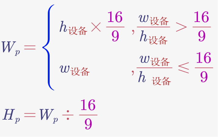
Wp 为页面有效宽度,Hp 为页面有效宽度
页面左右居中,上下居中,四周留白即可
然后在 head 里用 JS 设置 1rem = Wp / 100
element 用 rem
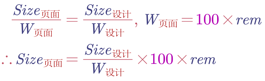
假设某 div 在设计稿中长 100px,设计稿宽度 1920px
那么该 div 在页面中长为 100/1920 * 100rem
最后可以写一个 px() 函数来计算 100px 对应的 rem
写个 scss 函数
1 | @function px($n) { |
代码:
1 |
|
使用 grid 布局
效果图

主要代码:
1 | .home { |
使用 Echart
安装 yarn add -D echarts
引入 import * as echarts from 'echarts';
chart1 效果图:
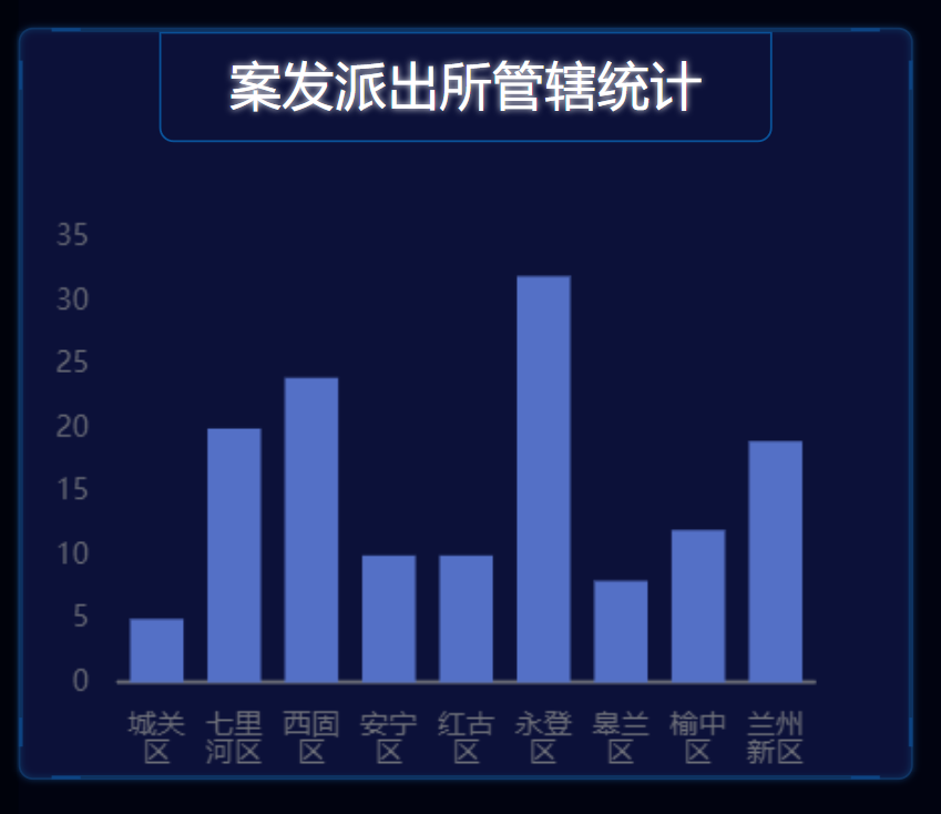
chart1 代码
1 | import React, {useEffect, useRef} from 'react'; |
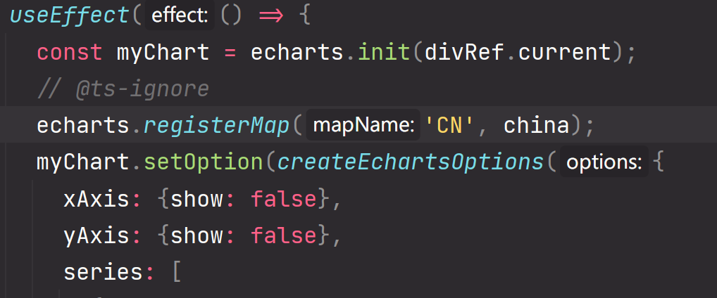
画地图
需要引入 china.json
1 | import china from '../geo/china.json'; |
echart 中注册一个地图: