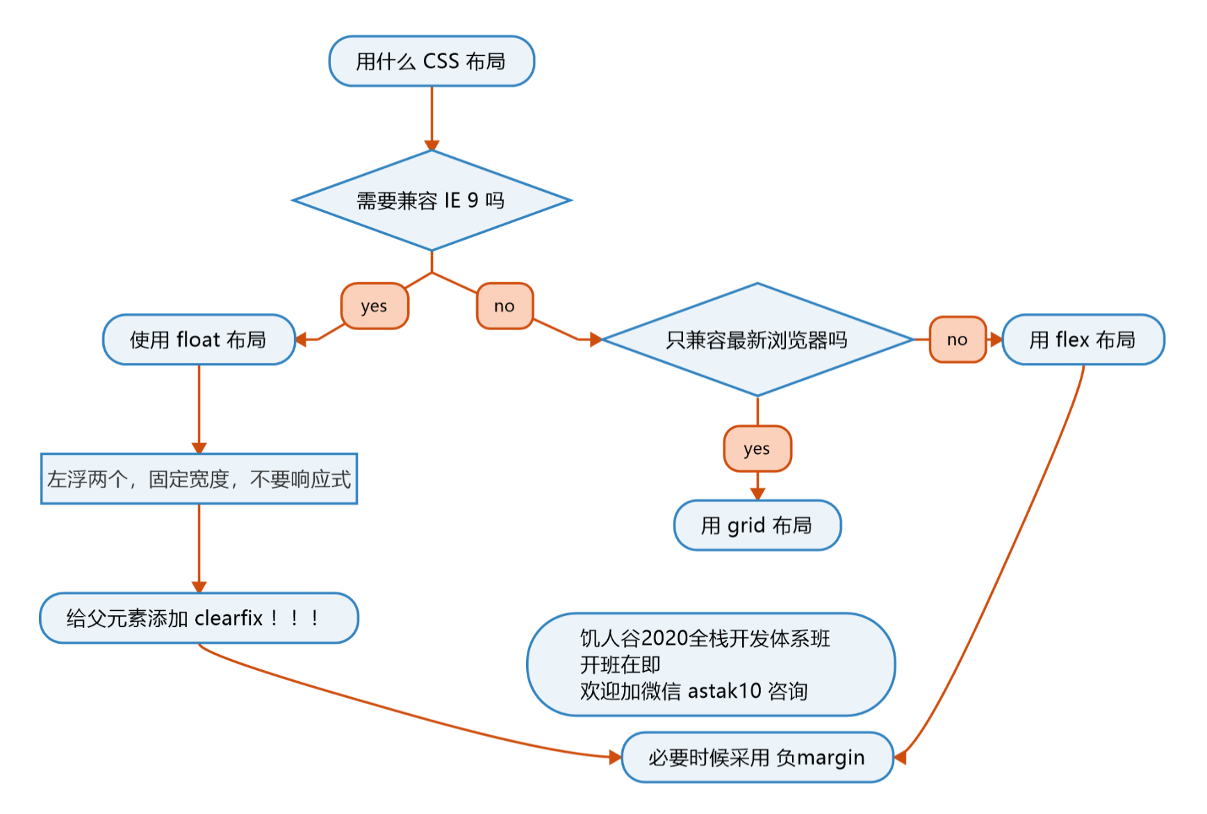
采用Flex布局的元素,称为Flex容器(fcontainer),简称”容器”。它的所有子元素自动成为容器成员,称为项目(item)。
1
2
3
| .box{
display: flex | inline-flex;
}
|
container
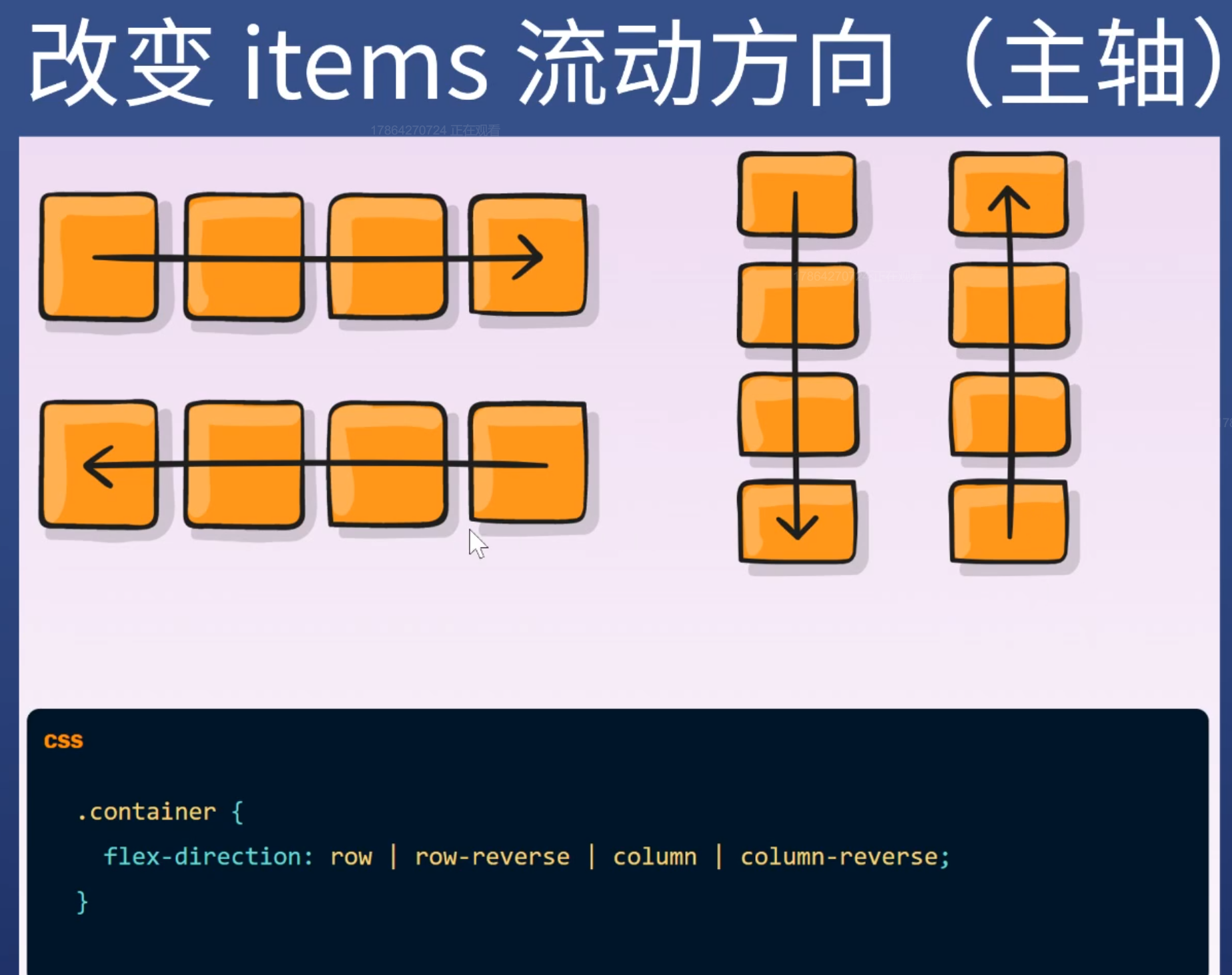
flex-direction
1
2
3
| .container {
flex-direction: row / row-reverse / column /column-reverse;
}
|
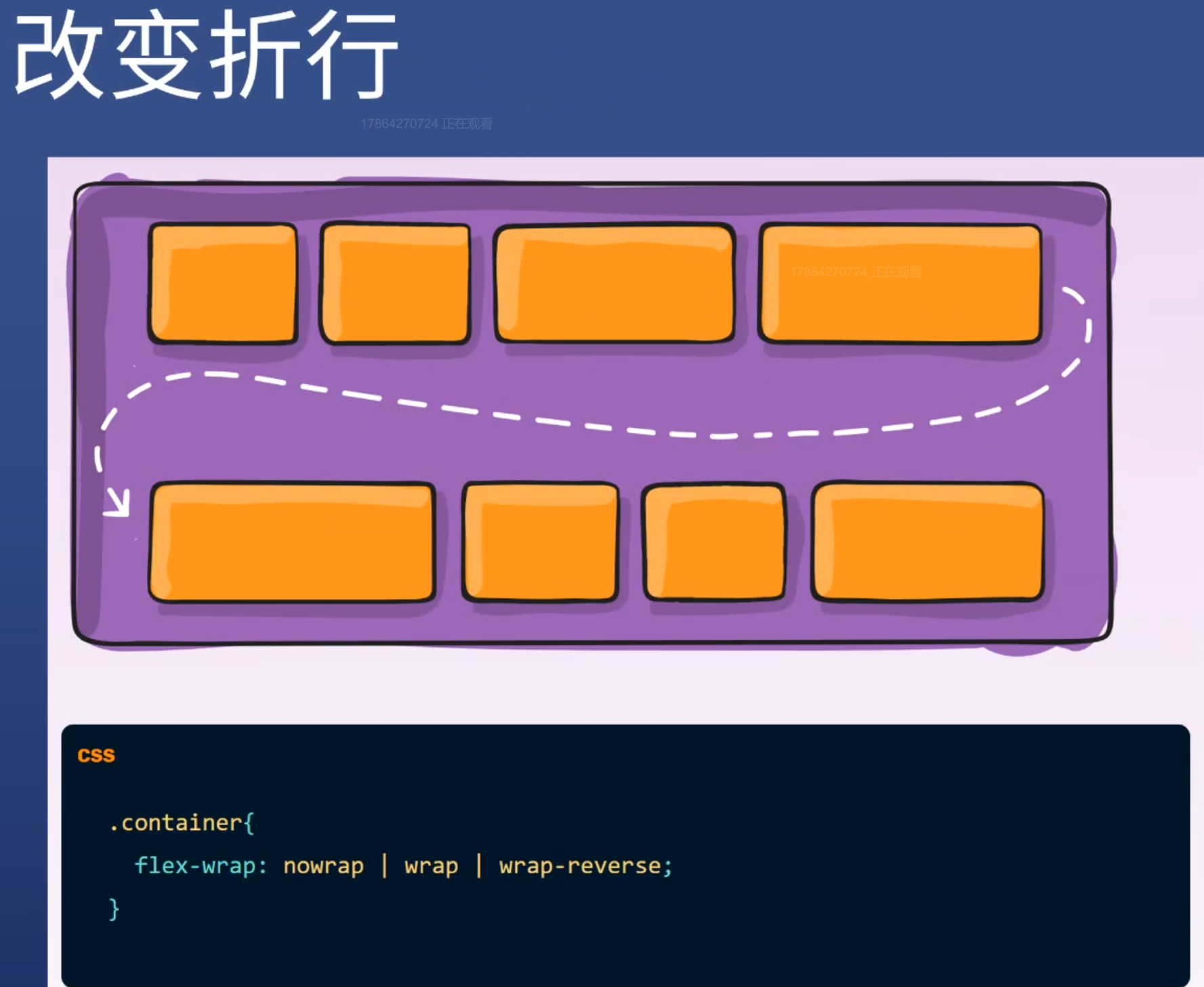
flex-wrap
1
2
3
| .container {
flex-warp: nowarp / wrap / wrap-reverse;
}
|
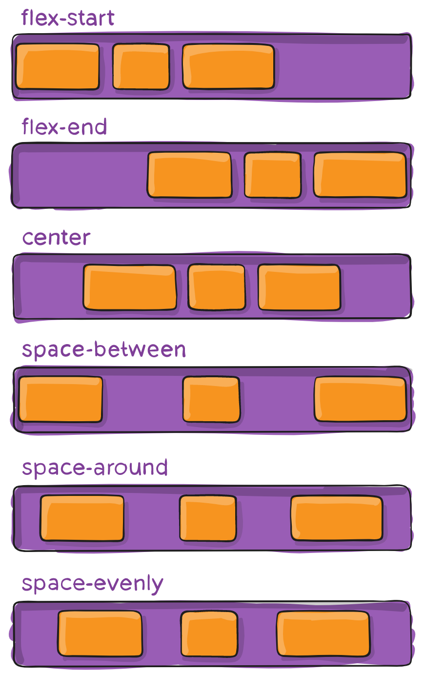
justify-content
1
2
3
| .container {
justify-content: flex-start / flex-end/ space-between / sapce-around / space-evenly;
}
|
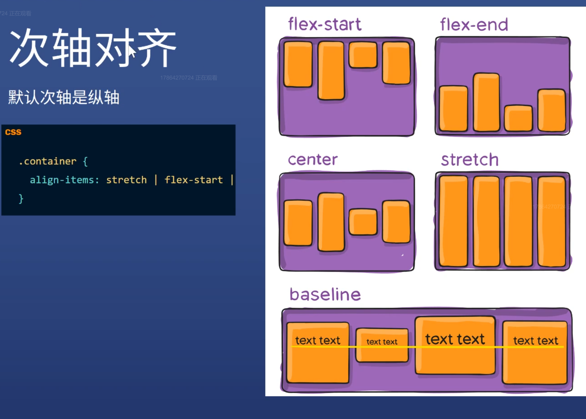
align-items
1
2
3
| .container {
align-items: flex-start / flex-end / center / stretch / baseline;
}
|
align-content
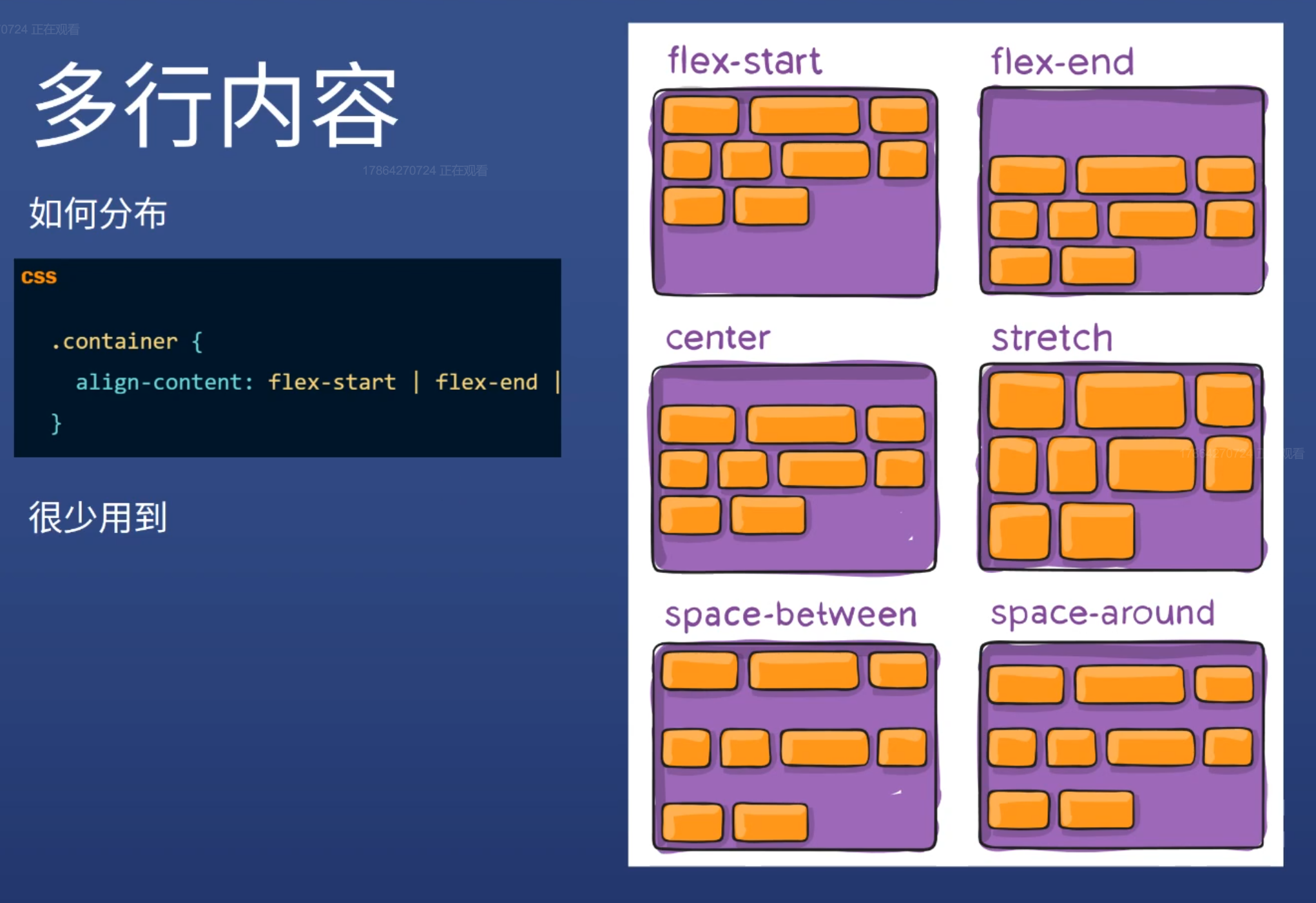
1
2
3
| .container {
align-content: flex-start / flex-end / center / stetch / space-between / space-around;
}
|
item属性
order
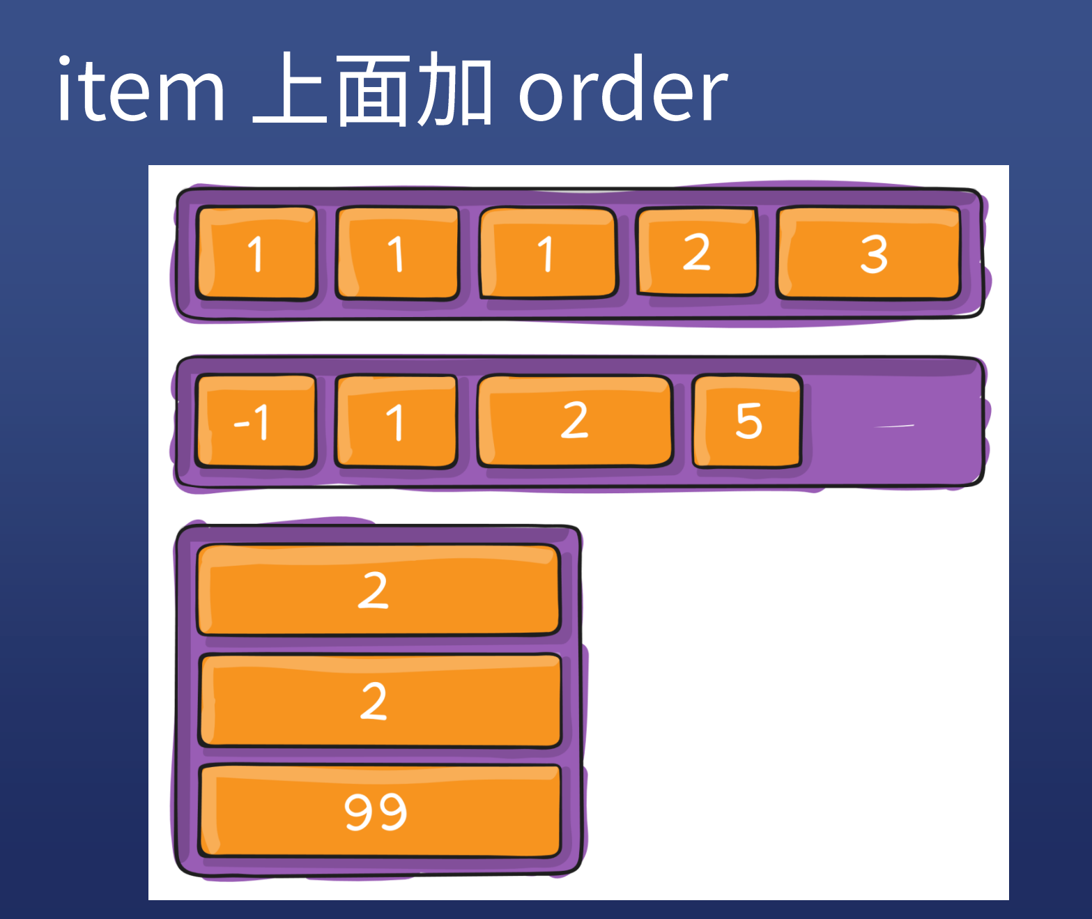
1
2
3
4
5
6
7
8
9
| .item:first-child {
order: 1;
}
.item:nth-child(2){
order: 1;
}
.item:nth-child(3){
order: -2;
}
|
flex-grow
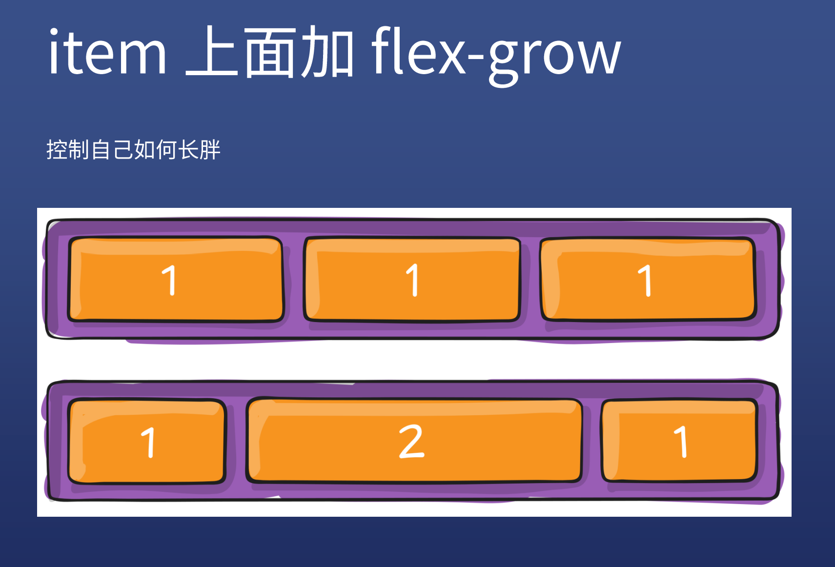
1
2
3
| .item {
flex-grow: 1 / 2;
}
|
flex-shrink
控制如何变瘦,一般写flex-shrink: 0;防止变瘦,默认是1
1
2
3
4
5
6
7
8
9
10
11
|
.item {
flex-shrink: 1;
}
.item:nth-child(2){
flex-shrink: 5;
}
.item:nth-child(3){
flex-shrink: 1;
}
|
flex-basis
控制基准宽度,默认是auto,就是宽度,不常用
1
2
3
| .item {
flex-basis: 100px;
}
|
align-self
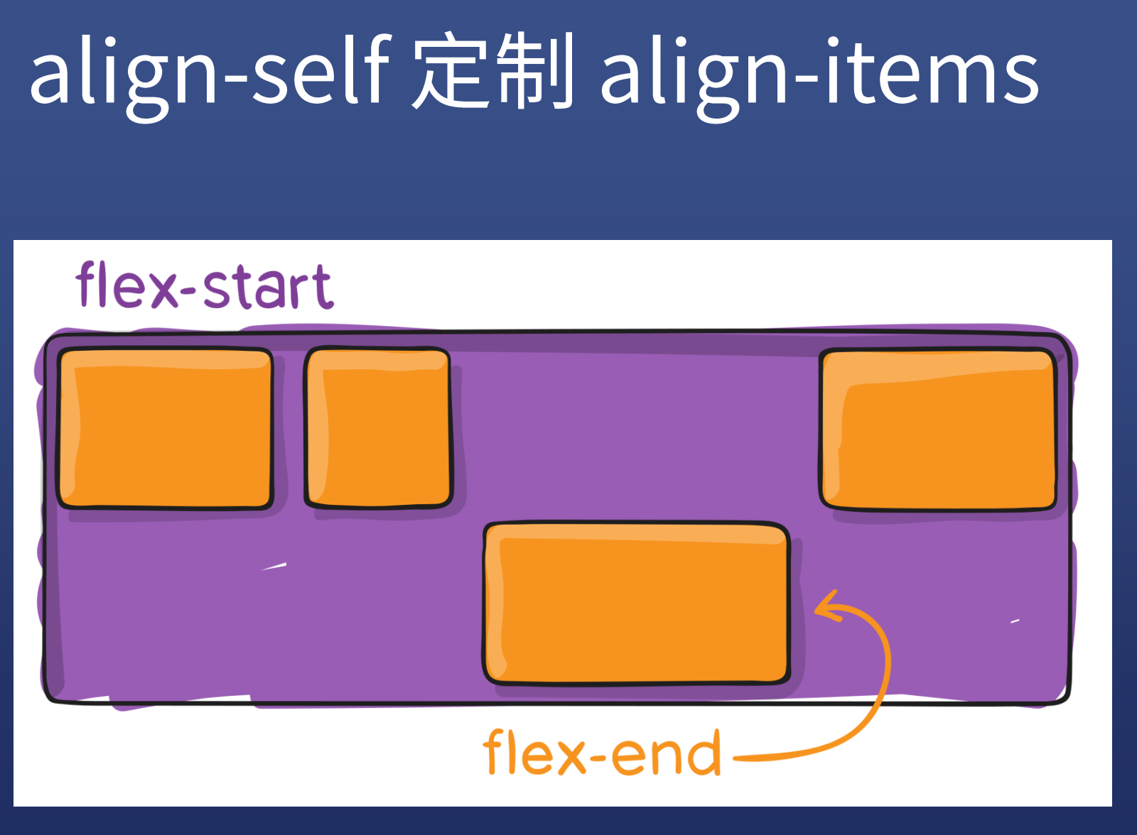
1
2
3
| .item {
align-self: flex-end;
}
|
重点
1
2
3
4
5
6
7
8
9
10
11
12
13
14
|
dispaly: flex;
flex-direction: row / column;
flex-wrap: warp / nowarp;
justify-content: center / space-betten;
align-items: center;
|
flex小游戏
Tips:
不要把 width 和 height 写死,除非特殊说明
- 写死 width:100px
- 不写死 width:50% / max-width:100px / min-width:80% / width:30vw
- 特点:不使用 px,或者加 min max 前缀
margin-xxx: auto和justify-content: space-between实现相同的效果,推荐使用前者
参考自A Complete Guide to Flexbox
问题
- 使用换行后 no-wrap,间距变大,在父元素加上
align-content: start